
Is my website mobile friendly? Test Responsive Web Design with Screenfly
A Quick and Easy Way to Test Your Website on Any Device
There are more mobile web users than ever before. The number of mobile web traffic is gaining the lead over desktop as the new default. This is what is being called mobile first. Google has been making it clear that responsive mobile first websites will be prioritized in Google search ranks. If your website isn’t yet mobile, or is having mobile issues, you will want to spend a bit more time with your website making sure that it is responsive and looks good across different devices and screen resolutions.
Whether it’s the latest android or iphone, tablet, or even big-screen TV, making sure your site looks great on all devices is essential. Luckily, the free tool Screenfly by QuirkTools makes this super simple.
In this blog post, we’ll look at what Screenfly is, how it works, and why it’s a valuable tool for anyone who cares about responsive web design.
What Is Screenfly?
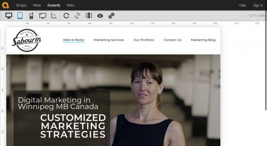
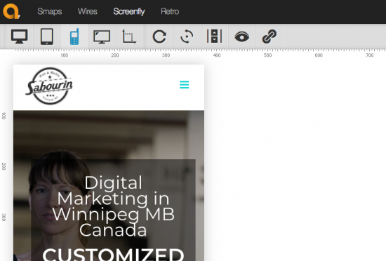
Screenfly is a free web-based tool that allows you to view your website on a variety of screen sizes and devices. Whether you’re testing for a smartphone, tablet, laptop, or even a large desktop monitor, Screenfly gives you a quick way to preview your site without switching devices.
All you have to do is enter your website URL, choose a device type and screen resolution, and you’ll instantly see how your site appears in that format.
Why Responsive Design Matters
More than half of all website traffic now comes from mobile devices. If your site isn’t mobile-friendly, you could be missing out on a huge chunk of potential visitors or customers.
Here are a few reasons why testing your site across devices is so important:
- Better User Experience: A mobile user shouldn’t have to zoom in and out to read your content.
- Higher SEO Rankings: Google prioritizes mobile-friendly websites in search results.
- Lower Bounce Rates: If your site looks broken or hard to use on a device, users will leave quickly.
- More Conversions: A site that works well on all devices is more likely to generate sales, leads, or engagement.
Key Features of Screenfly
Here’s what makes Screenfly stand out as a quick testing tool:
✅ Device Simulation: Test across phones, tablets, laptops, desktops, and TVs
✅ Custom Resolution: Enter any screen size you want to simulate
✅ Rotate Screens: Switch between portrait and landscape view
✅ Simple Interface: No downloads, no accounts — just paste your URL and go
✅ Free to Use: No subscription required
You can try it here: Screenfly by QuirkTools
Who Should Use Screenfly?
While Screenfly is great for developers and designers, it’s also useful for:
- Marketing professionals checking landing pages
- Small business owners reviewing their websites
- Content creators making sure blogs and portfolios look good on mobile
- Agencies doing quick client previews
Even if you don’t have a technical background, Screenfly is easy enough to use that anyone can benefit from it.
How to Use Screenfly (Step-by-Step)
- Visit quirktools.com/screenfly
- Enter your website URL in the field at the top
- Choose a device from the toolbar: desktop, tablet, mobile, or TV
- Click and view how your site looks on that device
- Rotate or change screen size as needed
Tip: You can also test internal pages like blog posts or contact forms by pasting in their specific URLs.
Limitations to Keep in Mind
While Screenfly is great for quick checks, it’s not a full replacement for real device testing or browser dev tools. It won’t reflect actual browser behavior, dynamic content loading, or JavaScript functionality. Think of it more as a visual layout checker than a full QA tool.
Final Thoughts
Screenfly is one of those tools every web designer or small business owner should have bookmarked. It’s fast, free, and incredibly helpful when you want to double-check how your site looks across devices.
Whether you’re launching a new website or just making updates, a quick run-through with Screenfly can catch visual issues before your audience sees them.
So next time you’re working on your site, take it for a spin and see how things shape up on mobile, tablet, and beyond.
Want help making your website mobile-friendly or responsive?
We can help! Contact us today to get started on a website that looks great everywhere.