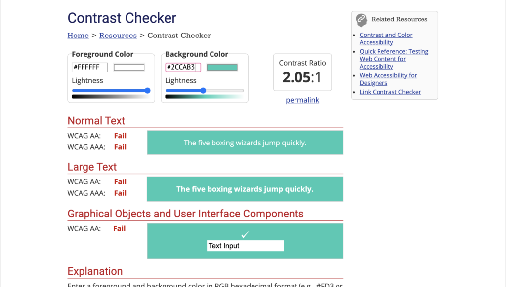
Use a colour contrast checker like the one over at WebAIM to test your website’s web accessibility. Visit https://webaim.org/resources/contrastchecker/
A colour contrast checker is a great tool for web accessibility. Text can be difficult to read when there isn’t enough contrast between the colour of a font and the background. Website standards ensure that the web is an accessible place and this includes visuals. Search engines like Google even factor in colour contrast into how they rank websites for SEO.
When designing a website, it’s important to consider accessibility for all users, including those with visual impairments. One crucial aspect of web accessibility is colour contrast, which can affect readability and usability. In this guide from WebAim, you’ll learn why colour contrast matters and how to ensure your website meets accessibility standards.

What is colour contrast and why is it important for web accessibility?
Colour contrast refers to the difference in brightness and hue between two colours. In web design, it’s important to ensure that text and other important elements have enough contrast with their background to be easily readable for all users, including those with visual impairments. Without sufficient contrast, text can appear blurry or difficult to distinguish from the background, making it challenging for some users to navigate and use your website. Ensuring adequate colour contrast is a critical aspect of web accessibility and can help make your website more inclusive for all users.
Understanding WCAG guidelines for colour contrast.
The Web Content Accessibility Guidelines (WCAG) provide specific guidelines for colour contrast to ensure that websites are accessible to all users. The guidelines specify a minimum contrast ratio between text and its background, with larger text requiring less contrast than smaller text. For example, the minimum contrast ratio for normal text is 4.5:1, while the minimum for large text (18pt or 14pt bold) is 3:1. It’s important to follow these guidelines to ensure that your website is accessible to all users, including those with visual impairments.
Tools and resources for testing and improving colour contrast.
There are several tools and resources available to help you test and improve the colour contrast on your website. One popular tool is the WebAIM Color Contrast Checker, which allows you to enter the foreground and background colours of your text and check if they meet the WCAG guidelines. Another useful resource is the Contrast Ratio website, which provides a simple calculator to determine the contrast ratio between two colours. Additionally, many web design software programs, such as Adobe Photoshop and Sketch, have built-in tools to check colour contrast. By using these tools and resources, you can ensure that your website meets accessibility standards and is accessible to all users.
Best practices for designing with colour contrast in mind.
When designing a website, it’s important to keep colour contrast in mind to ensure that all users, including those with visual impairments, can easily read and navigate your content. Some best practices for designing with colour contrast in mind include using high contrast colours for text and background, avoiding colour combinations that are difficult to distinguish, and using bold or underlined text to emphasize important information. It’s also important to test your website’s colour contrast using tools and resources to ensure that it meets accessibility standards.
The impact of colour contrast on user experience and inclusivity.
Colour contrast plays a crucial role in creating an inclusive user experience for all website visitors. For individuals with visual impairments, low contrast colours can make it difficult or impossible to read content, navigate the website, or complete tasks. By prioritizing colour contrast in your website design, you can ensure that all users have equal access to your content and services. Additionally, designing with accessibility in mind can improve the overall user experience for all visitors, leading to increased engagement and satisfaction.

